


EDUCATION
SwipeCards
Year
2020 - 2021
Company
Quizlet
Role
Product Design
The Challenge
The Quizlet mobile app lacked a clear value proposition compared to mobile web, with no easy way for users to focus on areas of weakness. Users needed to manually “star” terms to study them later, but only 15% of users used this feature, indicating the process was unintuitive and easy to forget, leading to missed opportunities for effective studying.
Previous Experience
To mark terms, users tapped the star icon and then manually filtered to “study starred only.” While functional, this workflow disrupted the flow of studying, making it inconvenient and underused.

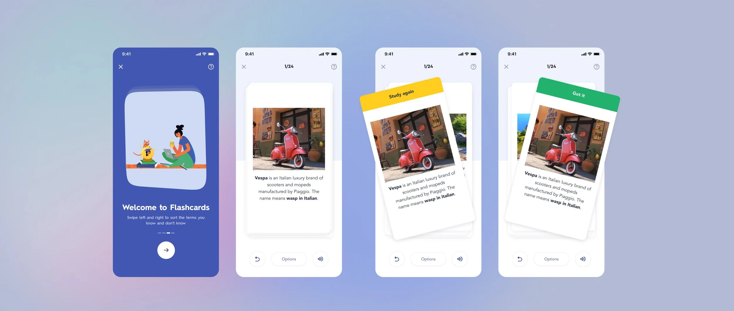
Solution: Make Studying Effortless
Introduced and simple swipe mechanism to replace the manual star system:
Swipe right if you know a term.
Swipe left if you don’t.
Continue studying only the terms you don’t know.
This made studying more efficient, engaging, and intuitive while adding a playful dimension unique to the native app. The swipe interactions also generated data Quizlet could use to further improve study recommendations.
Mobile Experience
Sorting Made Easy: Swipe to indicate if you know or don’t know a term.
Focused Learning: Users confirm familiarity before moving on, ensuring active engagement.
Effortless Continuation: A clear CTA allows users to continue studying only what they need to learn.

Tablet Experience
On larger screens, the swipe mechanism added a playful, tactile interaction while generating valuable insights on user progress. This strengthened the native app’s value proposition, creating a learning experience that felt personal and adaptive.

Outcomes
+10.2% increase in questions answered (from 143 to 158).
+15% increase in users reaching any end screen.
+0.85% lift in 7-day study retention.
+3% increase in the number of flashcards viewed.
+1.8% increase in median study minutes within 7 days.
4% reduction in users swiping in only one direction during Quiz mode.